Images chosen one by one
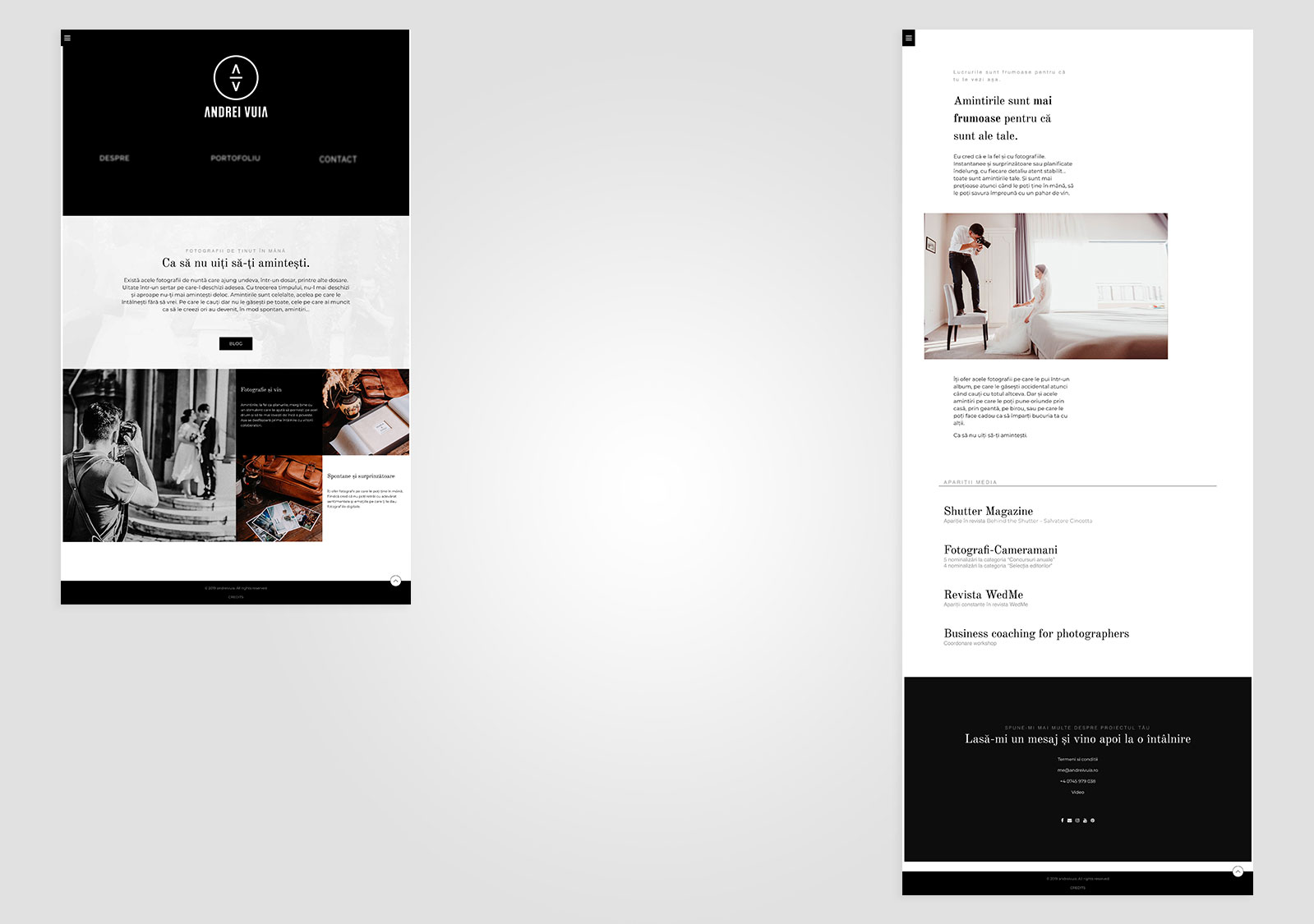
Andrei Vuia Photographer came to us together with his prestige. A high end branding refresh was needed: logo, domain, website, totally new visual identity and a suited tone of voice. His professional maturity needed a clear and well shaped image.
What we’ve made better: brand and user experience, storytelling, responsiveness
Obscured by the clouds
We took the courage to play with the fire in the menu bar. Excellent functionality and a good speed, we’ve offered a solution for solving the intentional puzzle created through the functions that look unavailable.
Navigation on the site is easy but got a mystery and interesting tone through the blur and hover that clarifies the situation. Before going on the spot, you have the chance to play a little. Less is more, and when the functionality and design and blended together in a creative way, less design meant more functional.

IDENTITY
Visual Principles
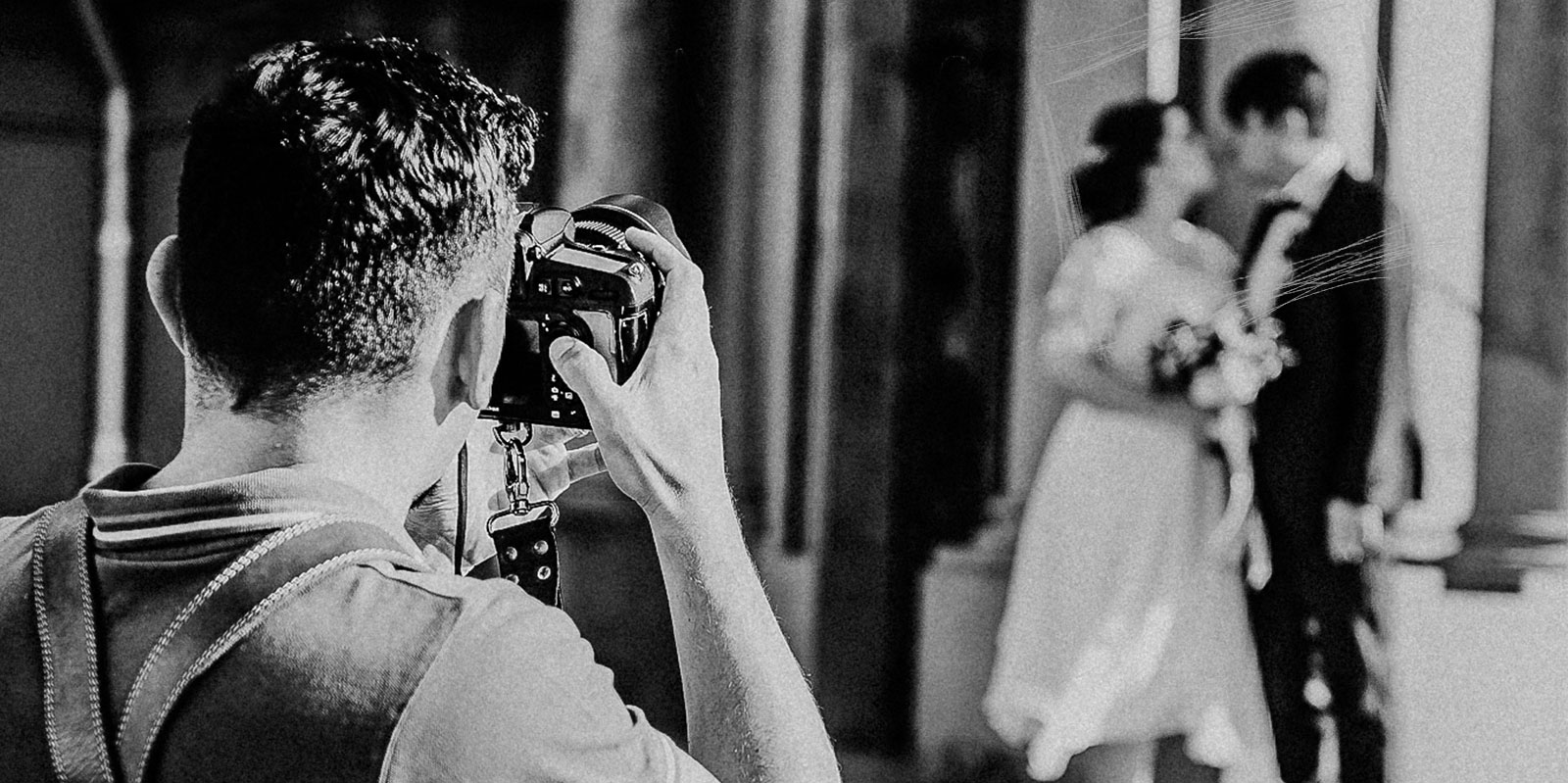
Andrei is one of those photographers that believe that images should last in time. He’s working in black and white so that you get the same feeling you get from old photos. We’ve followed his example.
We wanted for the people that visit the site to receive at least a bit of the feeling that a charged picture projects. It’s a visual story about the most beautiful days of your life. All made with: few words and strong pictures. This is the invitation to meet up.
![[:ro]profil[:]](https://www.celmaitarestudios.com/wp-content/uploads/2019/04/profil.jpg)
![[:en]prezentare-website-anastasia[:]](https://www.celmaitarestudios.com/wp-content/uploads/2019/08/prezentare-website-anastasia.jpg)
![[:ro]prezentare-website-zimmer[:] Zimmer Biomet Dental](https://www.celmaitarestudios.com/wp-content/uploads/2020/04/prezentare-website-zimmer.jpg)
